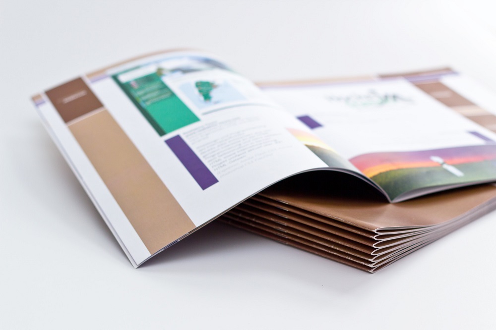
Creative brochure design ideas can help your small business get ahead and stay ahead of the game.
Brochures are awesome marketing tools that many companies use wrong. If your brochures are out of the norm and memorable, you have a huge opportunity to impress potential customers and improve brand awareness.
When it comes to creative brochure print or digital design, you have a ton of areas to play with. Here are a few popular trends to jump on for an imagination-driven brochure design.
Read on!
Utilizing Images and Color for Maximum Visual Impact
Creative brochure ideas should always focus on utilizing images and color to create maximum visual impact. Images can be used to effectively draw the reader’s attention and help to spark their interest in the product or service being advertised. Images should also help to create a cohesive narrative throughout the brochure.
Color should then be used to compliment the images and used to draw attention to key aspects of the overall story. The right combination of images and colors can make for an effective and attractive brochure.
Incorporating Visual Effects to Stand Out from the Crowd
Incorporating visual effects into brochure marketing for business helps them stand out from the crowd.
Visual effects can include dramatic photography, contrasting colors, and interesting textures. Photography should be used to tell a story and draw the reader in. While incorporating contrasting colors can give the reader a pop of life in the design.
Interesting textures provide dimension and direction to the design. When creating a brochure, it’s important to think of intriguing visuals that the reader won’t be able to ignore. Think of the way visuals move the reader through the brochure and make them excited to learn more about the product or service.
Incorporating Branding Elements for Cohesive Aesthetics
Incorporating branding elements for a cohesive aesthetic that reflects the company’s identity is key. These elements can range from logo placement to the choice of fonts to the selection of colors. When deciding on elements to include, the designer needs to decide which elements best communicate the brand’s message.
They should consider how the logo, font, and color selection will convey the intended emotions associated with the company’s identity. Sticking with a few essential elements is key to creating powerful branding statements within a brochure.
Optimizing for Different Sizes and Formats
It is important to optimize for different sizes and formats. It’s hard to replicate a design across different sizes and types of paper. Start to design brochures through the main page and then create variations to fit different sizes while still maintaining the same look and message.
Use visuals as much as possible to inform all variations. If a full page and a half page must be created, try incorporating different elements from the full-size page to the half page.
Use eye-catching colors and fonts to grab people’s attention. Make sure all of the text and visuals are necessary and relevant.
Ace Your Brochure Design Now
Creative brochure design ideas can act as a great marketing tool. Regardless of the audience you are trying to reach, a well-designed brochure can be an impressive way to package your message.
Create a unique story and memorable design that stands out in a crowded mailbox or online space.
If you want to explore the best topics, we’ve got you covered. Check out some of our other blogs today!


